Follow Us


What Is A Pareto Analysis?
The Pareto Analysis was developed by Vilfredo Pareto (1848-1923), an Italian economist who observed that a large majority of wealth in Milan was owned by a small minority of individuals.
The so-called Pareto effect or the 80:20 rule is a widely used analysis tool. Applied to quality problems it shows that the majority of defects (nominally 80 per cent) will be due to a minority (nominally 20 per cent) of identified causes of the defects.
This analysis technique involves ranking the collected data, usually using a check sheet, with the most commonly occurring problem at the top and the least at the bottom. How much each problem contributes to the grand total is expressed in percentage and cumulative percentages are used in compounding the effect of these problems.
The ranking of the problems is usually in terms of occurrence and /or costs. Just because one problem has a higher frequency of occurrence or causes the greatest wastage costs, does not mean that it has the highest priority. The results are often presented in two ways
- Ranked data in a bar chart or
- As cumulative percentages in a graph.
The Pareto Approach consists of:
A Pareto distribution is one in which the characteristics observed are ordered from the largest frequency to the smallest.
A Pareto Diagram is a histogram of the data from the largest frequency to the smallest.
Steps in a Pareto Analysis
The Analysis involves main four steps*
- Decide which “causes” to collect data about.
Decide which categories of the data items and the period over which data will be collected – then collect the data. - Tabulate the Data:
Arrange the causes in descending order and tabulate the data. Causes that contain only a few items can be combined and categorized as “others” and listed at the end, i.e.
| Cause | Number |
|---|---|
| A | 13 |
| B | 7 |
| C | 2 |
| D | 1 |
| Others | 2 |
| Total | 25 |
3. Calculate the percentage and cumulative percentage
To calculate the percentage, divide the number for each cause by the total and multiply by 100. To calculate the cumulative percentage, put the top figure in the new column and going down, add each new figure to the last, e.g.
| Cause | Number | % | CUM% |
|---|---|---|---|
| A | 13 | 52 | 52 |
| B | 7 | 28 | 80 |
| C | 2 | 8 | 88 |
| D | 1 | 4 | 92 |
| Others | 2 | 8 | 100 |
| Total | 25 | 100 | 100 |
4. Draw Your Pareto Diagram
See illustration. This example highlights the fact that 80 per cent of the problem is caused by factors A and B. If these two can be eradicated then most of the problem will be solved. Check this Pareto Diagram:

Please note that the Gremlins dragged the 20% arrow over too far. From the Pareto diagram we should see that 80% of the total amount of problems came from 20% of the known causes. (up to the dotted line).
Achieving Improvements
The importance of Pareto analysis is to enable goals to be set in planning for Quality Improvements. Although a very simple analysis technique it can be extremely powerful in presenting data by focusing attention on the major contributors to a problem. This will generate ideas, efforts and suggestions, thereby giving rise to great opportunities to solve the problems at hand. Used over time, the graphs can illustrate the continuous improvements over time.
Source: Jeffries, Evans and Reynolds, 1992.
Go to top of the Pareto Analysis page
Try Fiverr!
Free Online
Business Training

Online Course
- with Certificate -
Introduction To Quality Concepts

Training Course on Sale Right Now
Introduction To Quality Management Concepts.
Was: 69.95 Euros
Now: 49.95 Euros
So get your Certificate in Quality Management now, while the going is good!
FREE Ebook when you subscribe

Valuable tips, articles and updates delivered to your inbox every month
Recent Articles
-
What is Coaching, What is it not.
Feb 18, 21 07:04 PM
This article is about what is coaching, and what it is not. -
Cognitive Learning Style
Oct 31, 20 07:48 PM
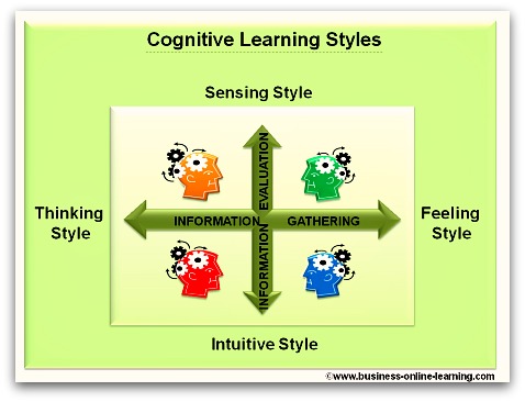 Get An Understanding Of Your Cognitive Learning Style And Become A Better Manager. By Understanding Yourself And Others Better, You will Be More Successful.
 -
Critically Questioning Information
Mar 26, 17 12:34 PM
 Data Manipulation Is Second Nature In Business, So How Good Are You At Critically Questioning Information? Get Advice Here.
Martha has exceptional, in-depth specialist knowledge.
Her work in eTraining resulted in immediate benefits and received wide acclaim by users worldwide, around the clock.
Her analytical thinking is reflected in her good judgement ability - in particular with interconnecting scenarios.
Her style of working and performance are characterised by meticulousness and reliability.
We deeply regret her leaving.
My last "BOSS"!

 My name is Martha and I have worked for over 30 years in various aspects of business and in various countries, right around the world.